Dear Texas

Dear Texas,

Your recent decision to cut off funding for women’s health care puts young and low income women and their families across your vast state in danger. I know that you claim that you are trying to prevent taxpayers from financing abortions, which is a controversial procedure, but cutting off funding for clinics that provide gynecological services and birth control is not the solution. You may not have heard this before, but birth control prevents unwanted pregnancies, which prevents abortions.

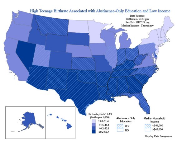
I know what you are thinking, Texas, you want to tell me that actually, women not having sex is cheaper and more effective at preventing unwanted pregnancies. Which would be true, except that you can’t make people stop having sex. No matter how many times you tell them that it’s bad. It doesn’t even work on impressionable teenagers. To convince you, I built you a map:

Continue reading

DVD: The Landscape of Nuclear Power

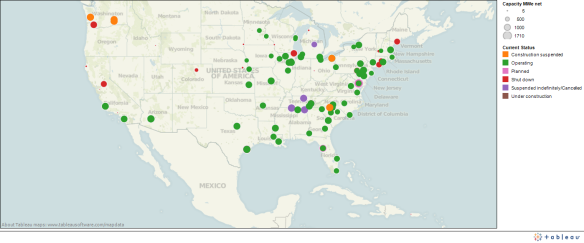
The newest nuclear power plant in the United States is 16 years old, in Tennessee. The oldest operating nuclear power plant is 43 years old, still producing power in Oyster Creek, New Jersey.  Currently, 104 nuclear reactors are running in the U.S., running in 31 states and producing 19.6% of our electricity. (Data from the Nuclear Energy Institute)

I’ve been looking for a data-set to play with while teaching myself to learn to use Tableau, an awesome data vis program, so I decided to use the federal government’s data on all of the Nuclear Power plants in the US, including those under construction, shut down, or still in the planning phase. To start, check out the map above that I made to show all of the locations of of reactors in the US. They are color coded by status, so the green dots show currently operating plants. The dots are also scaled by size; smaller dots represent plants producing less power.

Continue reading

Data Vis Diary: Words, words, words

I discovered Google’s ngrams last week through my data vis class. Basically, the Google Books project digitized millions of books and scanned all of the words, amassing a giant database of billions of the words published in the past 200 years. What’s really cool is that Google has built an online viewing tool that you can use to graph the frequency of any word that you are interested in, over any time period in the last 200 years. The results look like this:

Continue reading

Data Visualization Diary: Magazine Sales

(First post in my Data Visualization Diary series, where I explore a data set, try to find the interesting stories that the data contains, and practice techniques for using images to communicate the stories that the data has to tell. Through these experiments, I hope to learn what visuals work well, and which fail to communicate in an interesting, efficient, and understandable way. Comments and suggestions welcome)

Today, I picked a data set that journalists everywhere might find interesting. The 6 month data on magazine subscription and single issue sales were released by the Audit Bureau of Circulations. Only the data for the top 25 magazines in each sales category, circulation and single issue, were released online. You can see the data I started with on their website, here.

So, the first thing I noticed, looking at the data, is that subscription sales are much higher than single issue sales. Also, for the most part, different magazines made the top 25 in each category. Only 7 magazines made the top 25 in both categories:

Continue reading